الألوان والبعد النفسي لها في التصميم الداخلي
مقدمة: الألوان ليست مجرد عناصر جمالية تُضاف إلى التصميم الداخلي؛ إنها تلعب دورًا أساسيًا في التأثير على الحالة النفسية للأشخاص وتحسين البيئة التي يعيشون فيها. قد يختار العديد من الناس ألوان منازلهم أو مكاتبهم بناءً على الذوق الشخصي فقط، دون أن يدركوا كيف تؤثر هذه الألوان على المزاج والطاقة. في هذا المقال، سنتناول تأثير الألوان من منظور نفسي، وكيف يمكن استخدامها بذكاء لتحسين نوعية الحياة.
ما هو وصف وفلسفة اللون؟
فلسفة الألوان تستند إلى النظرية القائلة بأن لكل لون تأثير محدد على العاطفة والسلوك الإنساني. الألوان ليست مجرد ظاهرة بصرية؛ بل هي ترددات للطاقة تحمل تأثيرات على جسم الإنسان وعقله. تعود الفلسفة العميقة للألوان إلى العصور القديمة، حيث كانت الثقافات المختلفة مثل المصريين القدماء والهنود يستخدمون الألوان لعلاج الأمراض وتعديل المزاج. لكل لون تأثير نفسي مختلف، ومن هنا تأتي أهمية فهم كيفية استخدام الألوان بفعالية.

نسبة توزيع وتوازن الألوان داخل الفراغ
عند تصميم مساحة داخلية، فإن توازن الألوان واختيار النسب المناسبة لكل لون هو أحد العوامل الأكثر أهمية. توزيع الألوان بشكل غير متوازن يمكن أن يؤدي إلى خلق بيئة غير مريحة. يُنصح باستخدام قاعدة 60-30-10:
- 60% من اللون الرئيسي (للتأكيد على الإحساس بالاستقرار والانسجام).
- 30% للون الثانوي لإضافة طبقات وعمق.
- 10% للون المكمل أو المتباين لإضافة الحيوية والديناميكية.
هل يؤثر اللون على صحة الإنسان؟
نعم، الألوان تؤثر بشكل كبير على الصحة النفسية والجسدية للإنسان. على سبيل المثال، بعض الألوان مثل الأحمر قد تزيد من نبضات القلب وتثير النشاط والحيوية، بينما الألوان مثل الأزرق والأخضر لها تأثير مهدئ وتساهم في تخفيف التوتر. كما يمكن لبعض الألوان أن تحفز الإبداع والابتكار مثل الأصفر، فيما تعزز ألوان أخرى الشعور بالاسترخاء مثل البنفسجي الفاتح.
الألوان من منظور سيكولوجي
اللون الأخضر:
اللون الأخضر هو لون الطبيعة والتوازن. يعكس الاسترخاء والتناغم، وله تأثير مهدئ على العقل والجسم.
- الطاقة: يعتبر الأخضر لونًا متوازنًا للطاقة. يساعد على تقليل التوتر.
- الاستخدام المثالي: يناسب غرف النوم أو المساحات التي تحتاج إلى هدوء واسترخاء.
- الأماكن غير الموصى بها: لا يُفضل في أماكن العمل التي تحتاج إلى نشاط ذهني مستمر.
اللون الأحمر:
الأحمر هو لون الحيوية والقوة. يزيد من معدل ضربات القلب ويدفع الجسم إلى النشاط.
- الطاقة: هو أعلى الألوان طاقة ويزيد من مستويات الأدرينالين.
- الاستخدام المثالي: المطاعم أو الأماكن التي تحتاج إلى إثارة مثل صالات اللعب.
- الأماكن غير الموصى بها: غرف النوم، لأنه يمكن أن يؤدي إلى الأرق وعدم الراحة.
اللون الأصفر:
اللون الأصفر مرتبط بالشمس والطاقة الإيجابية. يحفز الإبداع ويعزز التواصل.
- الطاقة: يمنح الدفء والتفاؤل، لكنه إذا زاد قد يسبب التوتر.
- الاستخدام المثالي: المكاتب أو غرف الدراسة حيث يساعد على زيادة التركيز والإنتاجية.
اللون الأزرق:
الأزرق هو لون الصفاء والهدوء. يستخدم في المساحات التي تحتاج إلى جو مريح ومريح للأعصاب.
- الطاقة: يقلل من التوتر ويساعد على الاسترخاء.
- الاستخدام المثالي: غرف النوم أو الحمامات أو الأماكن التي تتطلب استرخاءً عميقًا.
- الأماكن غير الموصى بها: لا يُفضل استخدامه في المطبخ لأنه قد يقلل الشهية.
اللون البنفسجي:
البنفسجي هو لون الفخامة والإبداع. يشير إلى الروحانية والإلهام.
- الطاقة: اللون الملكي، يزيد من الإحساس بالفخامة.
- الاستخدام المثالي: غرف الأطفال أو المساحات التي تحتاج إلى تعزيز الإبداع مثل غرف العمل أو الاستوديوهات.
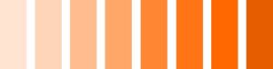
اللون البرتقالي:
البرتقالي هو مزيج من الأحمر والأصفر، يعزز الحيوية والطاقة ولكنه قد يكون ساحقًا إذا استخدم بكميات كبيرة.
- الطاقة: يضيف لمسة من الحيوية والنشاط.
- الاستخدام المثالي: أماكن اللعب أو غرف الجلوس العائلية.
اللون البني:
البني هو لون الاستقرار والطبيعة. يعطي إحساسًا بالدفء والراحة.
- الطاقة: يساعد على إضفاء لمسة طبيعية وعضوية للمساحة.
- الاستخدام المثالي: في غرف المعيشة أو المكاتب المنزلية لإضفاء الراحة والشعور بالأمان.
اللون الأسود:
اللون الأسود يرتبط بالأناقة والرفاهية ولكنه قد يكون ثقيلًا إذا استخدم بكثرة.
- الطاقة: يضيف لمسة من القوة والعمق، ولكنه قد يسبب الكآبة إذا استخدم بإفراط.
- الاستخدام المثالي: في التفاصيل أو الأثاث كإضافة للون آخر.
اللون الأبيض:
الأبيض هو لون النقاء والصفاء. يعطي إحساسًا بالنظافة والمساحات المفتوحة.
- الطاقة: يعزز الإحساس بالانتعاش ولكنه قد يكون باردًا إذا استخدم بشكل مفرط.
- الاستخدام المثالي: المطابخ أو الحمامات أو المساحات الصغيرة التي تحتاج إلى شعور بالاتساع.
تأثير الألوان على سلوك الإنسان
الألوان تلعب دورًا مهمًا في تحديد سلوك الإنسان ومزاجه. الألوان الدافئة مثل الأحمر والبرتقالي تحفز النشاط والحيوية، بينما الألوان الباردة مثل الأزرق والأخضر تعزز الهدوء والاسترخاء. الألوان الفاتحة تعطي إحساسًا بالاتساع والنقاء، بينما الألوان الداكنة تضيف عمقًا ورقيًا إلى التصميم.

العلاج بالألوان
العلاج بالألوان يعتمد على النظرية القائلة بأن لكل لون تردد معين يؤثر على جسم الإنسان. على سبيل المثال، يستخدم الأزرق في تهدئة الأعصاب وتحفيز الشفاء، بينما يستخدم الأحمر في زيادة الحيوية والنشاط. هذه الممارسة قد تكون مفيدة في التصميم الداخلي لضبط الحالة النفسية وتحسين جودة الحياة في المساحات المختلفة.

خاتمة
فهم الألوان واستخدامها بطريقة صحيحة في التصميم الداخلي ليس مجرد مسألة ذوق؛ بل هو علم يؤثر على الراحة النفسية والجسدية للأفراد. اختيار الألوان المناسبة للمساحات المختلفة يمكن أن يعزز الراحة، التركيز، والإبداع. لذلك، يُنصح بالاعتماد على متخصصين في التصميم الداخلي لضمان تحقيق التوازن المثالي بين الوظيفة والجمال في البيئة المحيطة.
Colors and Their Psychological Impact in Interior Design
Introduction:
Colors are not just aesthetic elements in interior design; they play a crucial role in influencing human emotions and improving the environment we live in. Many people select the colors of their homes or offices based purely on personal preference, often unaware of the profound psychological impact these colors can have. This article explores the psychological effects of colors and how they can be intelligently used to enhance the quality of life.
What is the Philosophy of Color?
The philosophy of color is based on the theory that each color has a specific effect on human emotions and behavior. Colors are not merely visual phenomena but energy frequencies that carry unique impacts on the human body and mind. The deep-rooted philosophy of color dates back to ancient civilizations, where cultures like the Egyptians and Indians used colors for healing and mood adjustment. Every color has a psychological impact, making it essential to understand how to use them effectively.
Color Distribution and Balance in a Space
When designing an interior space, balancing colors and selecting the right proportions is one of the most crucial factors. Improper distribution of colors can lead to discomfort and an unwelcoming environment. The recommended rule is the 60-30-10 rule:
- 60% should be the dominant color (to create a stable and harmonious feel).
- 30% is the secondary color, adding layers and depth.
- 10% is for accent or contrasting colors to bring vitality and dynamics.
Does Color Affect Human Health?
Yes, colors significantly influence both mental and physical health. For instance, colors like red can increase heart rate and promote activity and vitality, while cooler colors like blue and green have calming effects, reducing stress. Some colors even stimulate creativity and innovation, such as yellow, while others, like soft purples, help promote relaxation.
Colors from a Psychological Perspective
Green:
Green is the color of nature, balance, and harmony. It exudes a calming and relaxing effect on the mind and body.
- Energy: It is a balanced energy color that reduces stress.
- Best Uses: Ideal for bedrooms or spaces that need tranquility and relaxation.
- Not Recommended For: Workspaces that require mental stimulation and high energy.
Red:
Red is a powerful color associated with strength and vitality. It can raise heart rates and encourage physical activity.
- Energy: Red has the highest energy level, boosting adrenaline.
- Best Uses: Restaurants or play areas where energy and excitement are needed.
- Not Recommended For: Bedrooms, as it can cause restlessness and disrupt relaxation.
Yellow:
Yellow is associated with sunlight, energy, and happiness. It can stimulate creativity and enhance communication.
- Energy: Provides warmth and optimism, but overuse may cause anxiety.
- Best Uses: Offices or study rooms where focus and productivity are required.
Blue:
Blue is a calming and peaceful color, making it a great choice for areas meant for relaxation.
- Energy: Reduces tension and helps in stress relief.
- Best Uses: Bedrooms, bathrooms, or meeting rooms where a peaceful atmosphere is needed.
- Not Recommended For: Kitchens, as it may suppress appetite.
Purple:
Purple is a color of royalty and creativity. It often inspires a sense of spirituality and imagination.
- Energy: Adds a sense of luxury and sophistication.
- Best Uses: Children’s rooms or creative workspaces that require a boost of inspiration.
Orange:
Orange combines the energy of red and the warmth of yellow. It is vibrant but can be overwhelming if used excessively.
- Energy: Adds vitality and enthusiasm.
- Best Uses: Playrooms or family rooms for social interaction and energy.
Brown:
Brown represents stability and nature. It brings warmth and comfort to spaces.
- Energy: Provides a grounding and natural atmosphere.
- Best Uses: Living rooms or home offices to create a sense of security and coziness.
Black:
Black is associated with elegance and luxury but can be oppressive if used too much.
- Energy: Adds depth and sophistication, but can feel heavy and melancholic in large amounts.
- Best Uses: In small doses, such as accents or furniture pieces.
White:
White represents purity and simplicity. It can make spaces feel open and fresh.
- Energy: Enhances a feeling of cleanliness and modernity but can feel sterile and cold if overused.
- Best Uses: Kitchens, bathrooms, or small spaces that need to feel more spacious.
How Colors Influence Human Behavior
Colors have a profound impact on human behavior and mood. Warm colors such as red and orange tend to stimulate activity and energy, while cool colors like blue and green promote calmness and relaxation. Light colors give a sense of openness and purity, while dark colors add depth and sophistication to a design.
Color Therapy
Color therapy is based on the concept that each color has a specific frequency that influences the human body. For example, blue is used to calm the nerves and promote healing, while red is known for its energizing effects. This approach can be beneficial in interior design to regulate moods and enhance the quality of life in various spaces.
Conclusion
Understanding colors and using them correctly in interior design is not merely a matter of taste; it is a science that directly impacts the mental and physical well-being of individuals. Choosing the right colors for different spaces can enhance relaxation, concentration, and creativity. Therefore, it is advisable to rely on professional interior designers to ensure a perfect balance between functionality and aesthetics in the surrounding environment.